|
Previous:
Image quality< > Next:
Conclusions
Index of this page
Actual size
Now looking at "actual pixels" level to an
image is one thing, but depending on the size of the scan or digital
file, it may actually be rather deceiving. At 4525 ppi, these scans
represent a significant ENLARGEMENT compared to the original 60
x 90 cm test chart when viewed at "actual pixels" level.
Assuming an average 90 ppi computer screen resolution (Photoshop
by default assumes an even lower 72 ppi, my monitor runs at 92 ppi),
you would need a computer screen of ca. 1.1 x 1.7 meters(!)
to view the entire image at once! The scans on the previous page
actually represent just a tiny crop of the entire image.
So how do the blown up images look at their "actual
size" instead of "actual pixels"? Of course,
the definition of what the "actual size" is, is completely
arbitrary. A photographer can print his images at ANY size he wants,
from a tiny post stamp size print, to an image covering a ten story
high building block. However, as said before, we might arbitrarily
define "actual size" to be the size of the original test
chart, so a 1:1 reproduction. To show you this, I have resized each
image to represent a 60 x 90 cm image size, the size of the original
test chart. So in this case, you would need a computer screen of
that size to view the entire image!
So here they are, the images at their "actual
size":
|
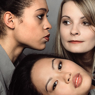
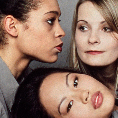
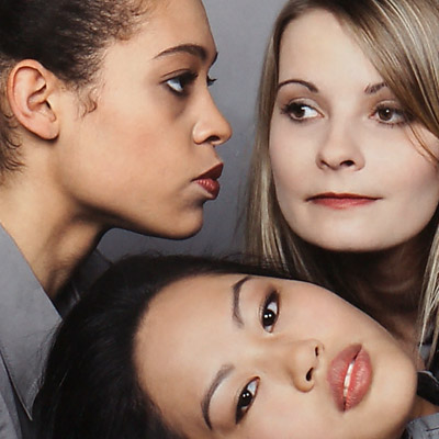
Direct flatbed scan (Canon 9950F)
|
Kodak TMax 100
|
 |
|
|
Kodak Portra 160VC
|
Kodak Ektar 100
|
 |
|
|
Fuji Velvia 100
|
Sony Alpha 900
|
|
|
Hey, that's looking quite different isn't it? You are
probably highly surprised at how small these images are at their
actual size, and you were probably expecting something bigger.
As you can see from these images, even the worst images in terms
of detail, the Kodak TMax 100 and Kodak Portra 160 VC shots, actually
don't look that bad at the actual size of the photographed test
chart. Still, Fuji Velvia 100 wins out on sheer detail, and the
Sony Alpha 900 has the ultimate edge, it almost completely reproduces
the original test chart's detail. Yet, Velvia 100 is getting very,
very close to this objective too.
Also note the highly saturated and somewhat unnatural
skin colors in the Portra and Ektar crops. Of course it would be
simple to reduce color saturation in Photoshop and have them match
the more natural colors of Velvia and the Alpha 900. However, these
films were designed to give high saturation in especially the red
part of the color spectrum, and hence reducing saturation would
both defeat the purpose of these films, which lies more in landscape
photography than portraiture, and cause an undesirable loss of saturation
in other colors. For example, if you look back at the Color
page, you will actually notice that both Portra and Ektar have a
quite normal blue and yellow saturation. Thus, reducing the overall
saturation of the image to combat the high red color saturation,
will lead to an unacceptable loss in blue and yellow saturation.
Previous:
Image quality< > Next:
Conclusions
|