|
Previous:
Per channel scan performance< > Next:
Image quality
Index of this page
Color
This is probably the least reliable part of this review.
Not only taking into account the personal and environmental (e.g.
room lighting) subjectivity of color perception, it is clear that
even with a well calibrated scanner and monitor, there still remains
lots of room for error in adjusting film scans. Unless a test chart
is shot with known RGB values for certain sections, which this isn't,
only the human eye can help in making the final image adjustments
to the scans to get as close as possible to the original testchart's
colors. Of course shooting with the Alpha 900 helped tremendously
too, because it proved to give very natural colors and thus provided
a kind of base reference. However, this can only be of help up to
a certain point, as all the films in this test are known - and were
actually designed(!) - to give certain color biases. For example
Kodak Ektar 100 was designed to give very high red saturation.
Despite better and more accurate scan results of the
overhauled Imacon 848, there still remain some minor issues, some
of which are caused by a slightly uneven flash exposure, causing
a small but visible shift in color from the center to the corners
of the images and slight colorcasts. Also, I have chosen not to
push highlight contrast to it's limits, meaning whites are not purely
white but show some clearly visible color casts. This was a consious
decision, so as to still have visible "grain" in the highlights.
Correcting these lower contrast highlights to neutrality or neutral
grey, proved difficult. However, all-in-all, results are way better
than the results I could achieve with the badly calibrated "backup"
Imacon 646, as refered to in the Introduction
of this article.
So, what CAN be said about the color of Kodak Ektar
100 compared to the other films? Well, looking at the images below,
you can see that, as Kodak's documentation about the film stated,
it has high color saturation, especially in the red region of the
color spectrum. It is in the same ballpark as Kodak Portra 160VC,
that may seem even more saturated in these scans. However, considering
the remaining issues I had to correct these scans, I wouldn't place
any significance on that last observation. In fact, according to
Kodak, Ektar 100 should have HIGHER saturation than Portra 160VC.
It may well be so, the difference between the image of Portra 160VC
and Ektar 100 is small and could well be explained by small differences
in color correction.
The main difference is with Fuji Velvia 100. Whereas
Kodak Ektar 100 shows a very high and somewhat unnatural color saturation,
Fuji Velvia 100 is close to neutral in it's color rendition. By
comparison, the Alpha 900 image is probably closest to the original
test chart in terms of color saturation and faithful rendition of
colors, although this image has the big disadvantage of the poor
flash. But the overall nature of the color rendition seems to be
about equal between this digital shot and Fuji Velvia 100.
Especially noteworthy is the difference in the red rendition
of Ektar and Portra versus Velvia. Whereas Ektar and Portra feature
highly vibrant, almost phosphorescent, reds, Velvia has a much more
neutral, almost cooltone, "bluish" red. Ektar 100, as
with Portra, maybe less suited for portraiture, where color accuracy
is often paramount, and more suited for landscape and architectural
photography. Also noteworthy is the high yellow saturation of Velvia.
Both Ektar and Portra feature a more neutral yellow, closer to the
Alpha 900 photo, which reflects the testchart's colors the best.
|
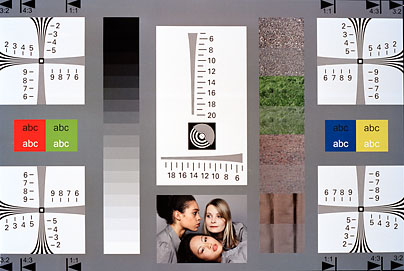
Kodak Ektar 100
|
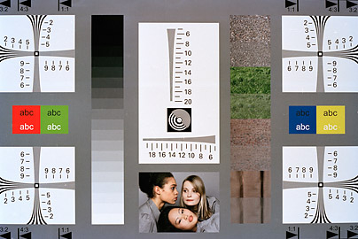
Kodak Portra 160VC
|
 |
 |
|
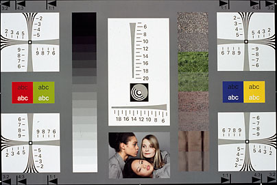
Fuji Velvia 100
|
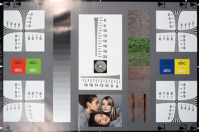
Sony Alpha 900
|
 |
 |
Previous:
Per channel scan performance< > Next:
Image quality
|